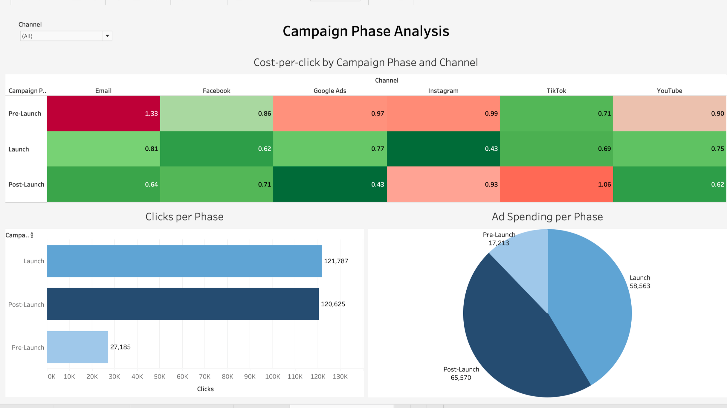
     For my final project in Introduction to Business Tools for Data Analysis and Visualization, I built an interactive Tableau dashboard analyzing campaign performance across different phases and marketing channels. The objective was to complete the full data pipeline, from gathering and cleaning raw data to performing analysis and presenting insights through visual storytelling.
     Using AI-generated campaign data, I structured and prepared the dataset for analysis. The completed dashboard provides a comprehensive view of campaign performance by comparing cost per click across channels and phases, total clicks generated in each phase, and overall ad spending distribution. It allows users to evaluate which campaign stage performed most efficiently, how spending shifted over time, and which channels delivered the strongest engagement relative to cost.
     Through heat maps, bar charts, and spending breakdowns, the dashboard highlights clear performance patterns between pre-launch, launch, and post-launch periods. This project strengthened my ability to design visualizations that are both analytical and intuitive, guiding viewers toward meaningful conclusions rather than just presenting data.
     In addition to completing this project, I earned my Excel Black Belt certification by passing a series of Excel certification exams, further strengthening my foundation in data cleaning, analysis, and modeling. Together, these experiences reinforced my interest in the analytical, behind the scenes side of marketing and business decision making.